Super Fi created two opens for MTV countdown shows What a Guy Wants and Ass Kicking Chicks.
|
You don't have to Web surf to find the latest design trends anymore. They have already washed right over into the broadcast field. They are generally Mac-based creations with a 2D, illustrated look.
"Pretty much everything on the air now has its roots on the Web somewhere," says Daniel Garcia, creative director of Super Fi (www.super-fi.com), a New York-based shop. "We've taken a lot of Web techniques and applied them to broadcast in a very tedious frame-by-frame way, which is the only way to get something that looks like that. Although it's tedious the payoff is worth it."
Left: V12 created the broadcast package for ESPN's Winter X Games. It was edited on Quantel Henry.
|
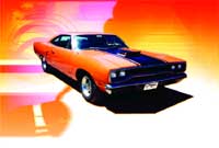
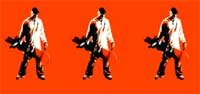
The look Garcia refers to appeared in packages for two MTV countdown shows that aired this past winter, What a Guy Wants and Ass Kicking Chicks. The guy show had a :15 open with a retro, yet current, hard-edged feel: a summer of '68 hot rod theme. A clean helvetica logo was airbrushed atop flames painted on the car. In the open, footage of "what a guy wants" - T&A, music, muscle cars - was seamlessly pieced together; there are no visible hard edits. The gal open, for the show about tough women and their music picks, featured artists and action silhouettes against graphic shapes of buildings, cars and other elements.
Video elements were created, rotoscoped, color treated and connected in Adobe Illustrator. Both packages were finished in Adobe After Effects, running on Mac G4s and a Windows 200 Dell workstation. Garcia notes the shop is moving over to the NT platform because he has found that Windows is more stable and faster when dealing with broadcast video. He also says there is more 3D software available and it is easier to do Web development on that platform. Garcia worked with designer/animator Justin Harder and intern Kenny Yee. John Yuiska was executive producer.
Super Fi's greatest challenge was the movement, marrying all those different clips into one element. "Illustrator is used a lot for Web work and a lot of the techniques we used were like Flash animation techniques, but in After Effects. Although we animated and roto'd in Illustrator, we actually went in After Effects and cut and painted frame by frame instead of doing it all over time," says Garcia.
TIP: To be willing to spend a lot of time, even if it seems daunting - the product will be worth it.
Meccanica helped relaunch the MSG network with show opens for the Mets pre-game and live broadcasts, the debate show Angles and the sports news show Sports Desk.
|
"What I'm hearing is what I call multiplicity, which is where the news is going: multiple things going on. [The] work that we've been doing in new media actually starts to apply to television graphics," says Dale Herigstad of H Design (www.hdesigninc.com) in Los Angeles. His shop, founded five years ago, focuses on traditional media such as television branding and design, as well as a lot of new media from interactive television to enhanced programming to wireless to kiosks. A redesign for a major cable network - one whose promo and on-air graphics are purposely short lived to avoid visual boredom, focuses on a system for displaying additional information. Imagine secondary images playing off other images. "Our work in enhanced programming is getting us this kind of work. It's a new kind of thing and I'm hearing it more often," says Herigstad, adding that this project was for a fun network, one that bills itself as pop television.
H Design is a Mac-based shop, with G4s among others. Design through After Effects is done in-house. Final posting is often done down the street at Hollywood Digital, as was the case with this project. Herigstad was the creative director, Robert Howell was lead designer and Fred Hoerr was After Effects artist.
TIP: Herigstad's tips revolve around his knowledge of new media. Some clients, like National Geographic for which H Design recently updated its international packaging, also create a style guide to fold new designs into print and Web advertising. H Design seamlessly delivers all the different parts. In this case, the animators created toolkits of a map design and vision strips that would incorporate many of those famous National Geographic still images.
H Design also saves money by relying heavily on the prototyping process, constantly mocking up motion tests in After Effects, then sending QuickTime movies to clients throughout the country.
"The influence from the Web, which is more of a flat look, is spreading into broadcast. Clients seem to prefer a shorter duration because whatever airtime they have they want to spend referring to the actual product," says David Hwang, co-founder and creative director of V12 (www.v12.tv), a network brand management and commercial production shop in Los Angeles. "I think there's so much visual language out there right now. Stylistically there's a '70s revival."
H Design used After Effects, running on Mac G4s, for this TNT open.
|
V12 recently created the broadcast package for ESPN's Winter X Games (and will soon begin on the summer version). The shop had to revamp an existing logo that was no longer hip to the chameleon-like youth culture. The :20 open triggered more unique design solutions. At one time, traditional :30 opens set a show's tone, says Hwang, but today's opens just need to identify the brand and act more as a billboard. V12 shot :90 of film and created several mini open versions, a :20 with the main music message and a half dozen :10 spots that the producers could use anywhere, anytime. Nobody wanted to see the same thing over and over again.
The three creative directors, Hwang, Juan Delcan and David Sparrgrove, stayed away from the traditional idea of animation with linear moves for the opens. The theme focused on crowd and athlete reaction shots rather than action, which is what the programming provided. Digital stills were stylized on a Mac G4 with After Effects. A Quantel Henry was used for editing.
"We're trying to change the idea of what broadcast graphics does and what they mean," says Hwang. The challenge, he adds, is keeping up with rapidly changing visual trends. For this project, he extensively researched the underground youth culture and positioned the X Games as mainstream, a full circle from the outsider status that it used to enjoy. He also listened very intently to his clients.
"We've definitely noticed a trend in the whole flat art, simple animation type stuff," says Dennis Randall, co-founder and creative director at Atmosphere 13 (www.atmosphere13.com) a New York City shop that specializes in graphic design and text animation for broadcast television and commercials. "A lot of it has to do with the Flash animation craze that happened over the Internet. Things have gotten simplified down to a lower frame rate, being able to do small file sizes from the Internet and people just liking that style and translating it back to TV."
He sites the broadcast show open for The Daily Beat on Metro TV, a cable network in Manhattan. The client wanted a high energy, modern open for its new music show (which aired from July 2001 through January 2002). It needed to include live action shots from the show and urban stills. Randall says the animators wanted the simplicity of working with very flat 2D graphics that had strong readability and fast transitions.
The graphic style is similar to what Flash animation looks likeffor for the Web, but the animation you can accomplish for broadcast can become much more complex and faster paced," says Randall. The live action was revealed within the graphic elements in order to avoid cutting to full screen shots and abandoning the design. The still images were strong graphic compositions shot with a digital camera. Atmosphere 13 used Adobe Illustrator to build the graphics and text, then After Effects for the animation. They use G4s.
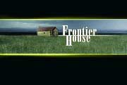
Click 3X in NYC created a main title, show open and series logo for Frontier House, a PBS program about three families who will lived as settlers did, in a remote corner of Montana. The families were faced with building cabins, tending to livestock, planting food and catching fish, all without the assistance of modern technology. Click 3X creative director Iain Greenway and designer Christine Lin worked closely with series producer Simon Shaw to develop the look, using Adobe Photoshop and Discreet's Inferno to create a single branding image to represent the story and suggest its emotional core. Additional Click 3X credits include Inferno artist Toni DiMauro and executive producer Lisanne McDonald.
|
"The challenge with this project was to balance a client who wanted to represent the show with a lot of visual references from the show itself, while still creating a very graphic and cool open," says Randall, who worked with Daryl Maloney, the other Atmosphere 13 creative director and co-founder.
"I don't feel there is any specific trend," says Micha Riss, founder and CD of Meccanica (www.meccanica.tv) in New York City. His branding and broadcast design shop was established in August 2001. "I do feel the industry has matured a lot and the clientele is far more understanding of fonts and designs. Now you're able to do a better product."
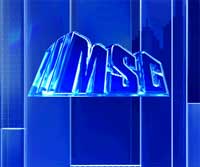
Meccanica just completed the relaunch of MSG network, a large, New York-based cable sports provider. The total redo included show opens for the Mets pregame and live broadcasts, the debate show Angles and the flagship sports news show Sports Desk. The Sports Desk open had to convey both sports and info so its design allows for headline shots to tease into the show. The signature animation then leads into highlights and segues into the open animation. Moving quadrants with logo elements and sports silhouettes - half wireframe, half polished 3D - resolve to create the show logo. It all takes :15. Viewers can watch it three to four times daily.
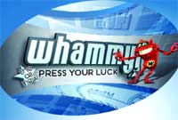
The Content Project in Santa Monica and WIT Animation in Venice recently teamed up to create the graphics package for The Game Show Network's Press Your Luck. The package includes an updated Whammy character, which was modeled using Discreet's 3D Studio Max. Adobe's After Effects and Photoshop were also used. The character was also rendered in Flash animation for the show's Web site.
|
The Mac shop used After Effects and Discreet Combustion on G4s to create the package. Since MSG broadcasts live high definition, some IDs and interstitials that air during the live broadcasts, were done in HD. One is the Hero ID in which glass panels reveal the MSG logo. Those were created with a combination of 3D and After Effects compositing.
The challenge, Riss says, was to avoid visual and musical cliches that bedevil sports and entertainment programming. This design was tasteful and unique, not over-the-top and noisy. The music was heroic and young, not heroic and old.
TIP: Click with the client and incorporate their knowledge of the product.
"I think show opens can often be one of the least design trendy things we do just because they are often so subject specific," says Ada Whitney, creative director/director at Beehive (www.beehive.com) in Manhattan. "It's not like you're trying to create an image. It completely depends on the audience and the content of the show. I love working on things that are purely abstract design."
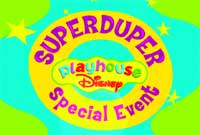
Beehive gave the open for Disney's Superduper Playhouse package a theatrical look using an Avid and Adobe's After Effects, Illustrator and Photoshop.
|
Beehive is working on a package of opens for "Playhouse Disney," the Disney programming block for two to five year olds. The shop redesigned the basic packaging last year and, this year, has been developing opens and closes to wrap around short one-to-two-minute interstitials. Beehive has created four :05-:10 of them, complete with logos; four more are to come. They began airing this winter. The open for "Superduper Playhouse Disney Special Event" wraps around special movies and a travel show, and the client wanted a theatrical look. So a little girl in a feather boa appears in a filmstrip, a boy pops up in a top hat, and twinkly stars fall down. The Superduper letters animate out of the hat and resolve into the rest of the donut-shaped logo.
The children were shot on greenscreen, the footage was taken into an Avid whose clips were passed through a TranShare program into the After Effects station. The logo was created using Illustrator and Photoshop, then combined in AE, which even handled the greenscreen matting. Hardware was Mac G4s. Nate Pommer was editor, Lise Dupuis was designer/animator and Harold Moss was shape animator. The challenge, Whitney says, was to come up with quick iconic images.
TIP: Know your client well, and know that they know their product, which Disney surely does, says Whitney. "You hear mixed things about Disney but "Playhouse Disney" is so together, they know their product so well - they work with child psychologists - they are deeply immersed in the language of that network. Since we've been working with them over a year, they send us footage, the show's name and tell us what it's about, then let us take it from there. We communicate very well. There are rarely major revisions."